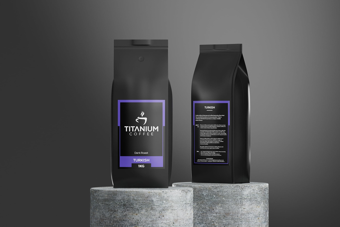
Project: Rebranding + New Packaging Design
Challenge
To design new branding and packaging fit for an exceptional coffee blend range.
Solution
I re-designed the logo, as well as the packaging, to create a more contemporary, premium-looking coffee which would not only make the product more appealing but also attract a wider audience. Given that Titanium Coffee is a micro-roastery producing small batches, the new logo was designed almost like a stamp. Labels could be printed, but other branding elements such as sales bags and business cards could be stamped or stencilled, reducing costs. A vibrant, yet simple colour scheme sets apart the various blends in the range.
Result
True coffee connoisseurs who appreciate the art of brewing often also have a keen eye for design and aesthetics. When a product looks good, it's perceived as better. The rebranding of Titanium Coffee not only transformed its visual identity but also positioned it as a premium micro roastery, ready to captivate coffee connoisseurs and beyond.


